
Can we all agree on one thing? Landing pages are a big deal. They act like a giant net, capturing traffic from lead generation effort, click-throughs, email marketing and more.
But so many people think that “if they build it, they will come,” and that couldn’t be farther from the truth (oh, but we can wish!). Landing pages take a keen eye, a heck of a lot of strategies and constant optimization. And, there’s no better time to roll up your sleeves and try a few tweaks than during the holiday season, when your tactics can make or break your online success.
We’ve dusted off our bag ‘o’ tricks to bring you the best tips to help you spiff up your landing pages for holiday shoppers.
Find your purpose.
That is, find your landing page’s purpose. If you don’t have one, you’ve got a problem; you might as well be throwing spaghetti at the wall to see if it sticks.
So, think about what you want users to do on your page.
- Do you want them to buy immediately?
- Request a demo?
- Sign up for a freebie trial?
- Download an eBook?
Whatever it is, that sole purpose should become the top focus of your landing page.
Simple, clear call to actions
We’ve all landed on pages that are asking us to do too much—Sign up for this! Download that! Don’t forget such-and-such!
Landing pages shouldn’t confuse viewers. On the contrary, they should hold viewers’ hands, inviting them in and walking them through every step they need to take to do what you want them to do.
The most critical part of this is your call to actions. Ditch your generic “Contact us now!” buttons and get even more granular, by creating buttons with explicit, clear instructions in them, placed in strategic locations throughout your page. “Above the fold” is an obvious one.
For example:

“Download the whitepaper now,” is a better button than “Learn more.”
It offers an explicit step for the view to take, one that is difficult to be confused about. It also tells them what to expect (they’re about to get that whitepaper they’re eyeing).
Don’t overthink your design.
We all want to cram in our favorite graphics into a page, but restraint can be lucrative.
Get rid of excess links, copy that doesn’t do anything and graphics that aren’t over-the-top simple. A clear design will always take you farther.
Think about how you want viewers to feel.
We get first impressions about everything – products, car test drives, people we meet, restaurants we eat at.

Landing pages are no different. Give some thought about the impression you want to leave. How do you want to be perceived? How do you want people to feel when they view your page?
The colors, images and layout you choose all fold into this impression, so choose wisely.
Keep it professional.
Who would you rather give your credit card information, or email address to a company with a landing page chock full of spelling errors, images that don’t download and dated graphics? Or a crisp, clean landing page that feels streamlined, modern and…well, legit?
These subtle (or not so subtle) clues are subconscious trust indicators—they inherently tell viewers whether they should count on your business or not.
More examples: third-party reviews, press mentions, and secure website badges. These are all signs to viewers that your company is real, verified and liked by many.
It better be mobile friendly.
At one time, mobile landing pages and websites were considered innovative. Now they’re considered standard.
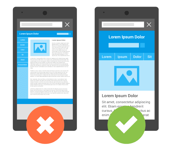
In fact, your website visitors expect to be able to view your pages on their tablet or phone, period. Not having mobile-friendly pages will lead to visitor abandonment and frustration, not to mention immediately making your company appear antiquated.
Don’t forget these other must-haves
A part of us feels silly bringing these up, but you wouldn’t believe the landing pages we see where these key elements are missing:
- Phone number
- Email address
- Social media links
- Contact forms
These elements are basic ingredients, but when they go missing, they will leave a visitor baffled and likely turned off (you’ll be lucky if they ever return).